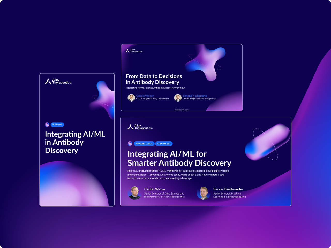
Creating a digital experience that could be bold for the brand and reassuring for patients

TR1X needed a digital presence that could speak to two very different audiences: the broader biotech community and patients considering participation in clinical trials.
I helped shape the creative direction alongside the Wizardly design team, then took the lead once the direction was approved. From there, I guided the project through design and development, balancing hands-on design with directing another designer, evolving the design system, shaping page content and UX, and managing client approvals and developer handoff.
Creative directionFinding a visual direction bold enough to stand apart in biotech while creating a more reassuring experience for clinical trial patients
We began with a collaborative moodboarding session before developing three creative directions, including one intentionally bold concept that pushed beyond the expected visual language of biotech.
I worked with our Creative Director to refine the concepts and ensure each had a distinct point of view, then presented the directions to the TR1X team. The client gravitated toward the boldest direction for the corporate brand, while another felt better suited to the more reassuring experience they wanted for clinical trial patients.
We refined the two together, creating a visual language that could shift in tone and align with their various target audience.
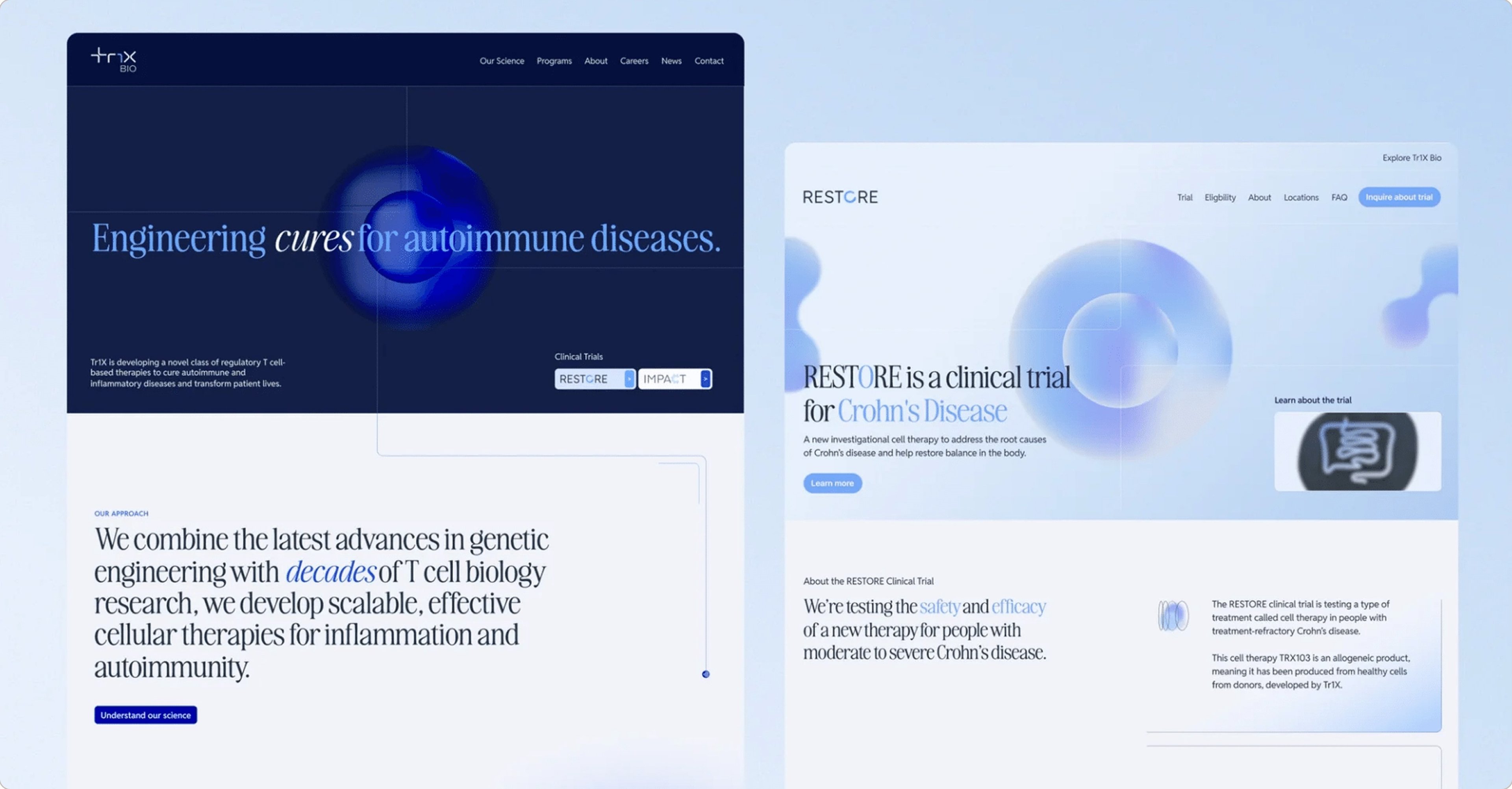
Leading the project through launch
Once the creative direction and homepage were approved, I led the wider site through design and development. For each page, I focused first on the audience, what needed to be communicated, and how the content should flow, often refining client-provided copy before moving into design.
I balanced hands-on design with directing another designer, using Loom to share goals and my initial thinking while leaving room for them to explore. I reviewed the work to keep new ideas aligned with the brand and design system. Alongside design, I managed client reviews, revisions, and development handoff, keeping both workstreams on track toward launch.
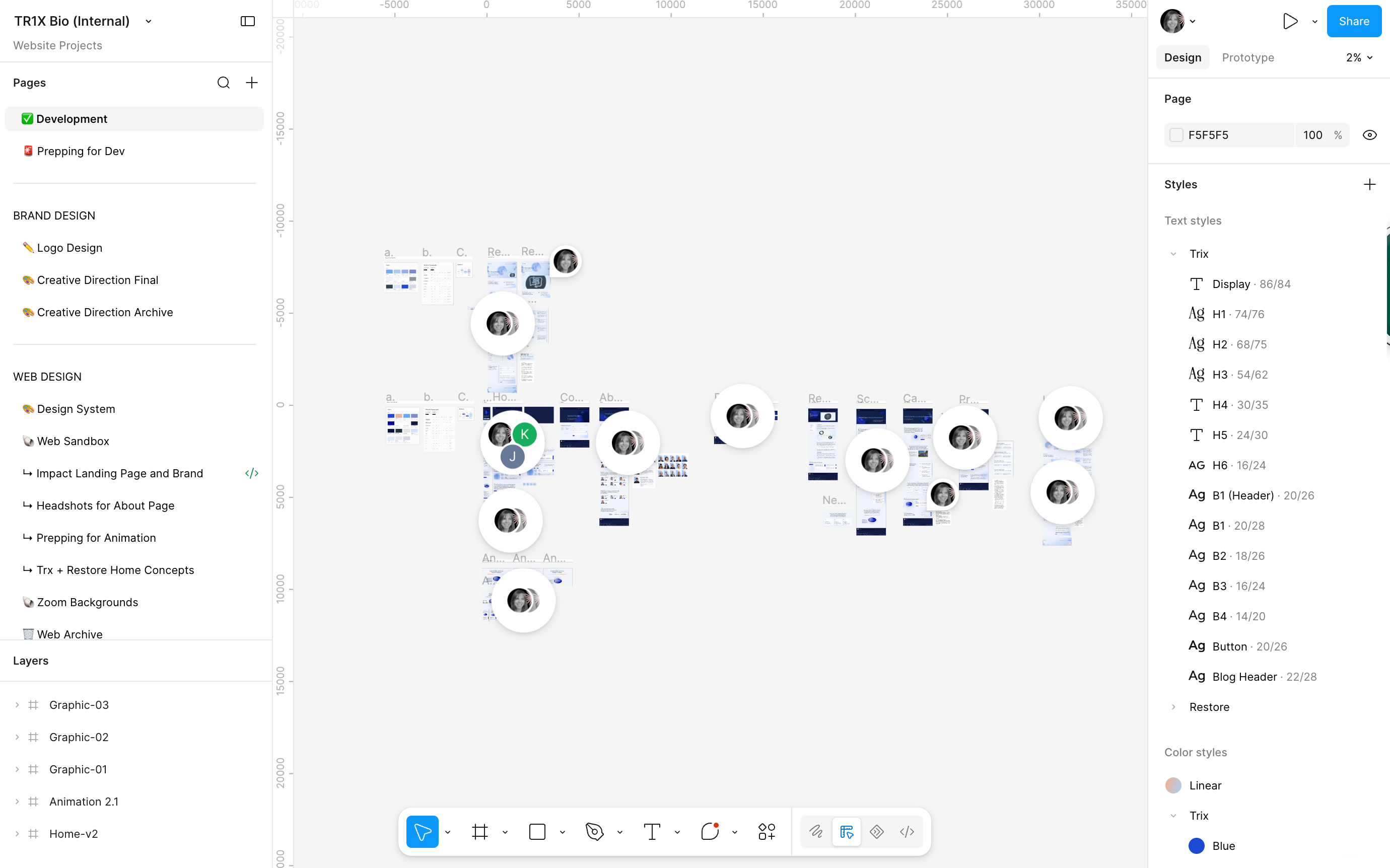
Interaction & MotionTurning TR1X’s layered visual language into interactive moments that move with users throughout the experience
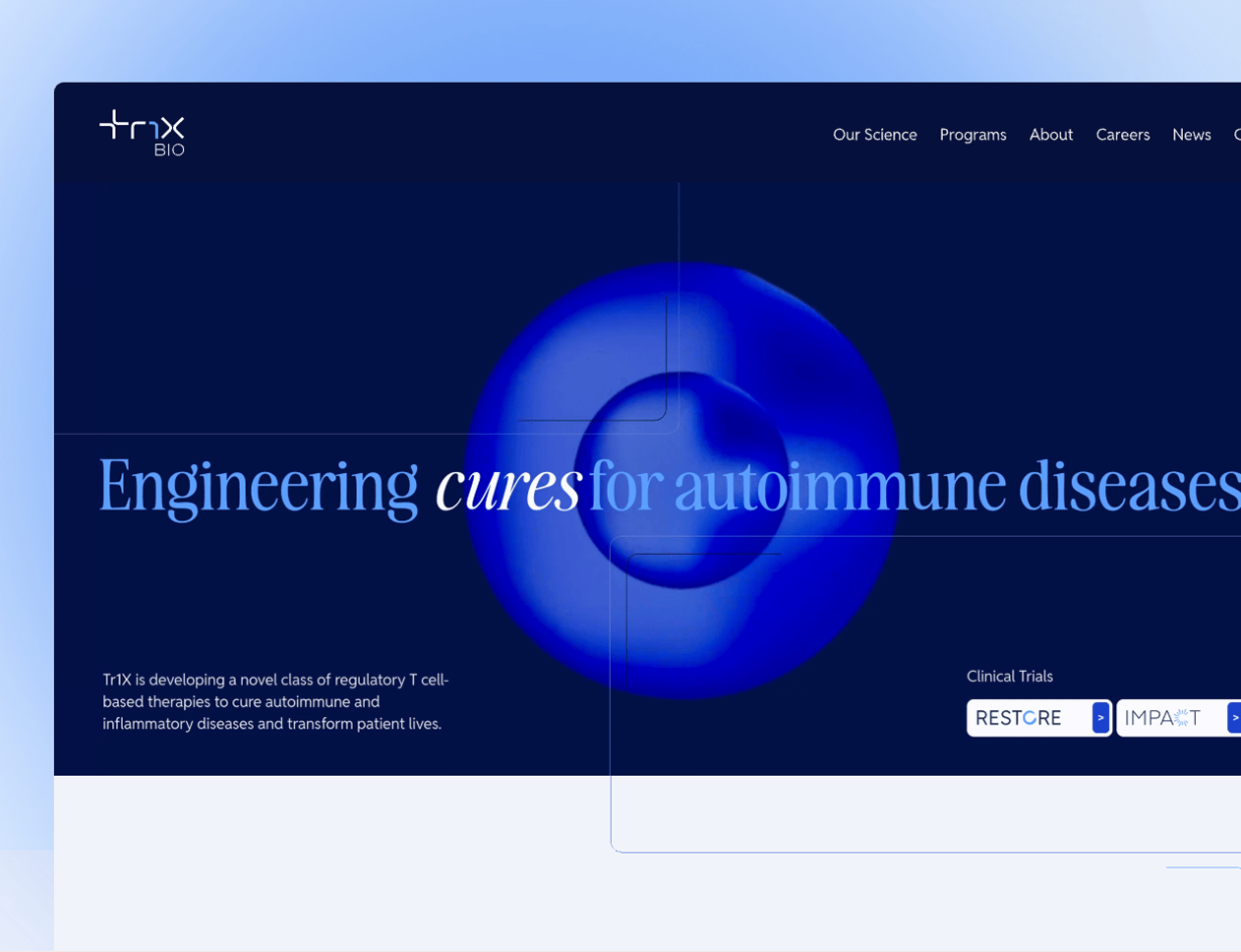
Bringing movement through the homepage
Meg developed the layered gradient graphic that became a key part of the brand direction. I had the idea to bring it to life through motion, transforming the static graphic into an animated hero.
From there, I wanted the interaction to extend beyond the header. I pulled the round gradient form from the graphic and envisioned it traveling with users as they scrolled, disappearing and reappearing between sections to create a visual thread through the homepage.
I mocked up the interaction in Jitter to communicate the movement and timing to our developer. I intentionally kept it exclusive to the homepage, where it could create a more expressive brand experience without getting in the way of the site's more content-focused pages.
Prototyping an ambitious interaction to explore what was possible, then simplifying the idea into an experience better suited to the web
For the program highlights, I explored how a layered graphic developed during creative direction could become an interactive way to navigate TR1X’s three programs. My original concept connected it to the scrolling orb, creating a more dimensional experience that transformed as users moved through the content. Through that process of animating, I realized the original concept was becoming better suited to a linear animation than an interactive website.
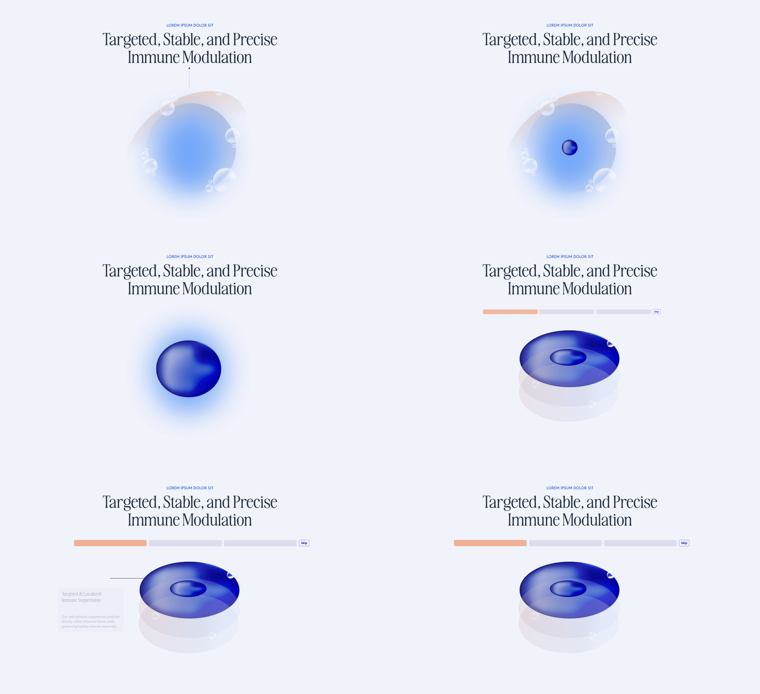
I simplified the experience into three interactive layers, with each program coming forward and filling with the brand gradient when selected. I prototyped the final interaction in LottieLab as well, giving development a clear model for how it should behave. The final interaction kept the depth and movement of the original idea while creating something clearer, more intuitive, and better suited to the web.
More Projects