Learning Animation on a Deadline and Consolidating a Brand That Lived in Six Files
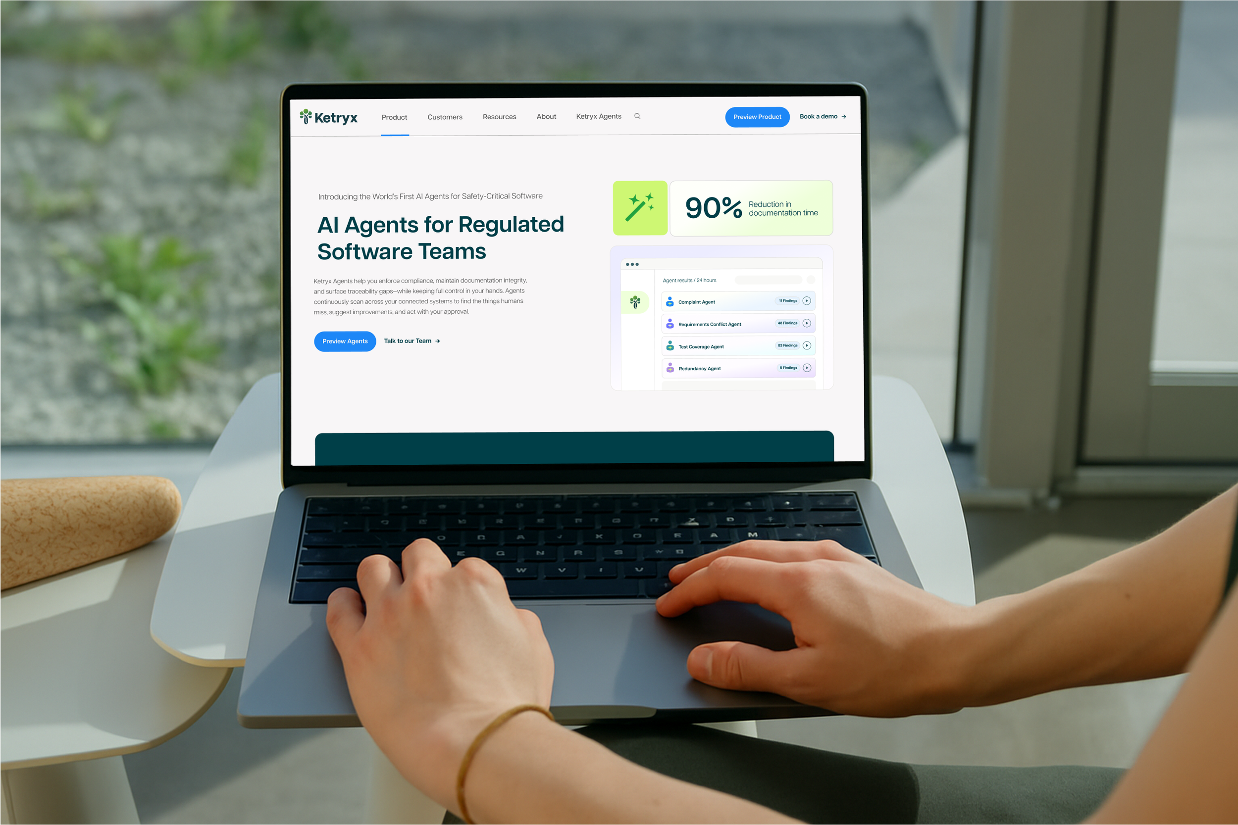
What this case study coversI worked with Ketryx from 2024 to 2025, first through two separate engagements and then through an ongoing design subscription.
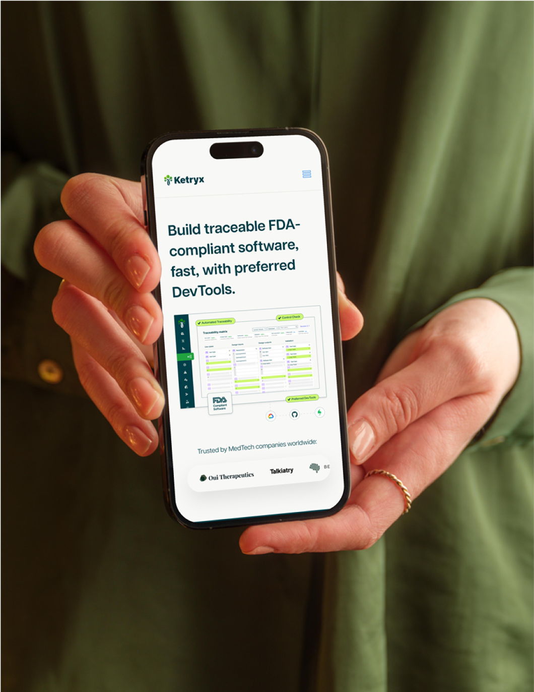
In that time the work covered branding, website refresh, the design system, multiple animation projects, and everything that came with keeping a growing company in market, from decks and one-pagers to event collateral and stickers.
There are two parts of this engagement I want to go into more detail on. The first is the hero animation, which I had no motion experience with before this project. The second is the brand system, which had grown across six files over the course of the engagement and needed to be consolidated into one reference both our team and theirs could work from.
Focus oneI hadn't animated anything before this project, but the home page needed it and I wanted to be the one to figure it out.
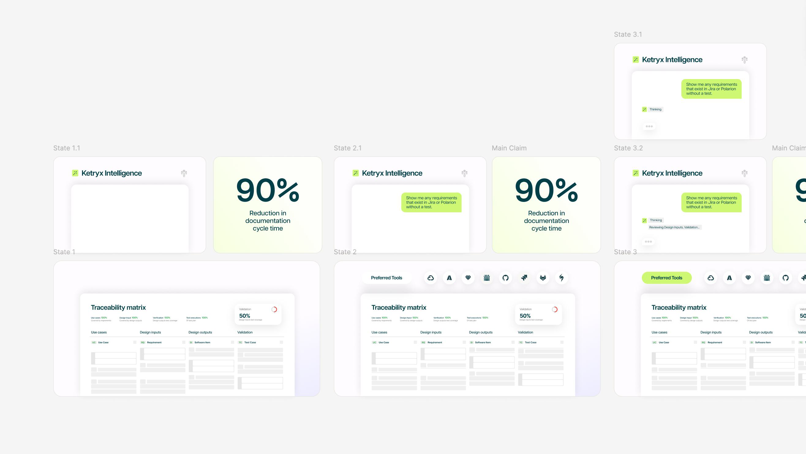
During the website refresh, the goal was to make clear that AI had been part of the Ketryx product all along. The primary animation, in the home page hero, showed this with a bento design where a user chats with the bot and the dashboard updates live in response.
It had to be built as two separate animations so the developer could assemble the bento layout, which meant the connection between them was something I had to create.
Storyboarding before animation
The storyboarding happened with the client while the concept and messaging were still being approved, and I made sure I was part of it so I could confirm this was possible to build inside Jitter.
We outlined every step in Figma first, which locked the concept and the copy before I animated anything. By the time I got into Jitter I was only working on how things moved, and it kept the revisions focused on timing instead of design. Since this was my first animation project, it's also where I figured out how to organize an approved design in Figma so it would transfer cleanly into Jitter.
Focus twoAfter several engagements the brand was living in too many places, so I built one file both teams could reference to keep the brand consistent across all touch points.
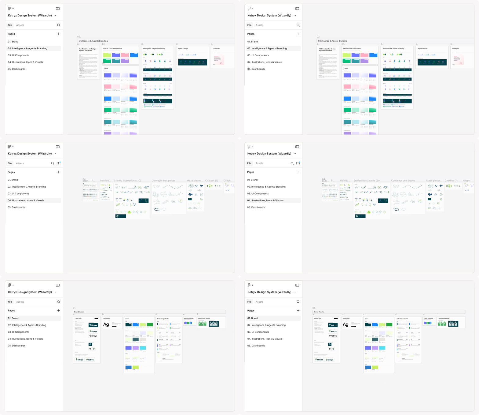
By 2025 the brand was living across three internal files organized by year, plus separate client-facing files split between marketing and web. Every engagement had added to it, the files were running out of space, and the refresh we did that year changed enough from the original that keeping things consistent meant knowing which file to trust and which parts of it were still current.
This wasn't a rebrand. We had been building the brand since 2024 and the work still held up, so the refresh was about refining what was there and the design system was about getting it organized. I went through every file and consolidated everything into one place: the color system with what each color means and where it's used, the fonts, the icons, the illustrations, and the rules behind how it all fits together. It gave our team and theirs the same reference, and it gave Ketryx somewhere to bring new people up to speed on the brand and pull the assets they needed.
More Projects