Web design where every choice pulls its weight


I design and art-direct websites end-to-end. From homepage strategy to responsive page builds to dev handoff, I lead the design and stay close to the work through implementation.
HOW I WORKA website is a narrative and navigation tool at the same time. Every visual choice, from color to layout to typography, should do both: give the brand a voice and help the user get where they're going.

Lead with strategy, then design
Before layouts, I want to understand what the site needs to accomplish and how users will move through it. That thinking shapes everything from page hierarchy to section structure to where the calls to action land.
Shape the content, not just the containers
Client copy often arrives unfinished or written for a different format. I rework content for clarity and alignment with the layouts I'm building, designing user flows that guide people through each page's story.
Art-direct with intention
I make deliberate creative choices per project. Typography scale, photography style, section-by-section layout variation. The goal is a site that has a real visual identity, not a template with swapped colors and logos.
Collaborate closely with development
I design in Figma with handoff in mind and work directly with developers through build. When interaction intent isn't obvious in a static mockup, I provide animation references or find live examples so nothing gets lost between design and code.
SECLECTED WORK

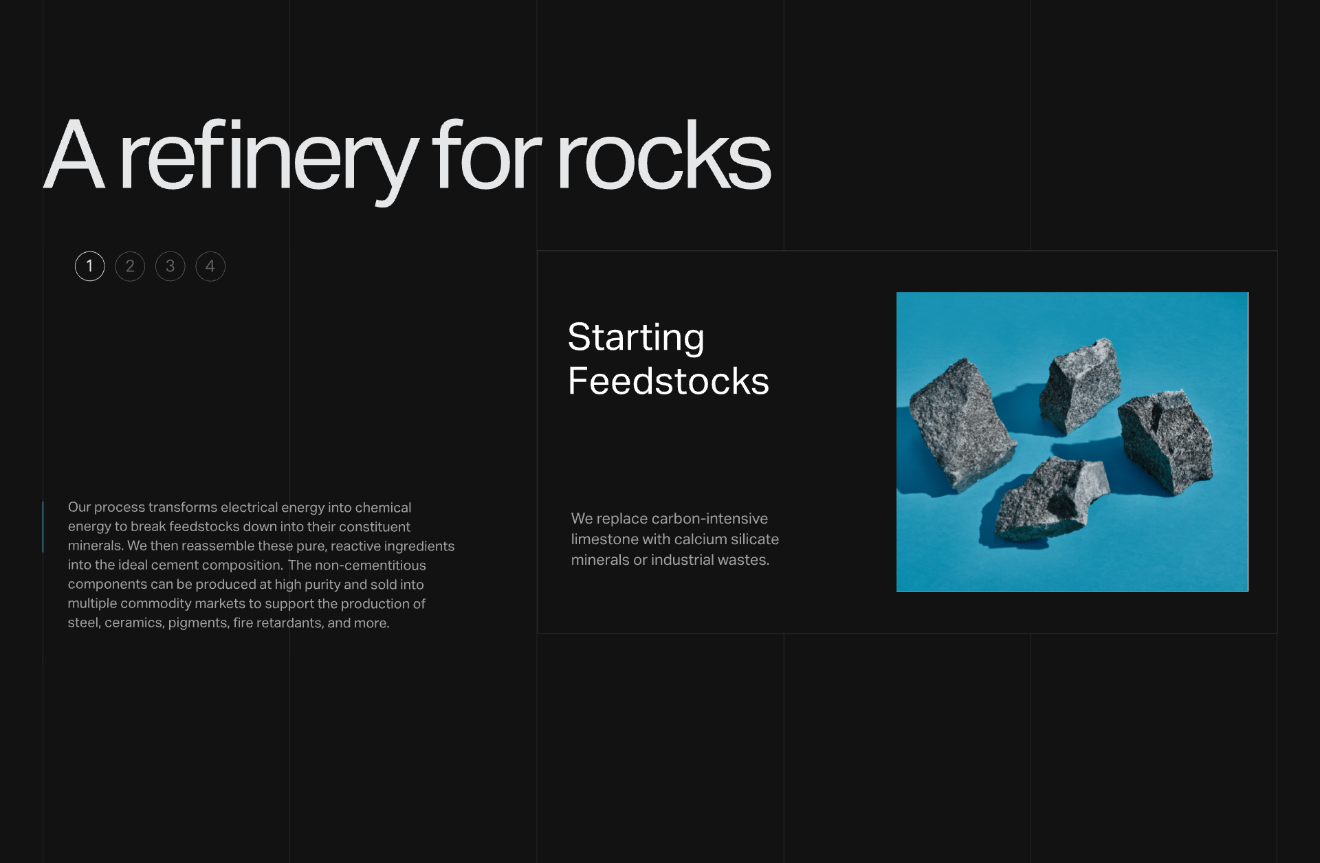
XtalPi
End-to-end website design and art direction for a growing biotech company. Magazine-style layouts with bold typography, large photography, and a color-per-product system that unified brand identity with site navigation. Over 10 desktop pages plus full mobile responsive design, custom interactive graphs, and scroll-based interactions.
Ketryx
Homepage refresh and brand messaging strategy for an AI-first software company. Helped the team articulate their positioning and brought it to life through a redesigned site experience.
Sublime
Interaction-led website refresh where motion and micro-interactions became the storytelling layer, reinforcing the brand's positioning as forward-thinking.
CONTACT