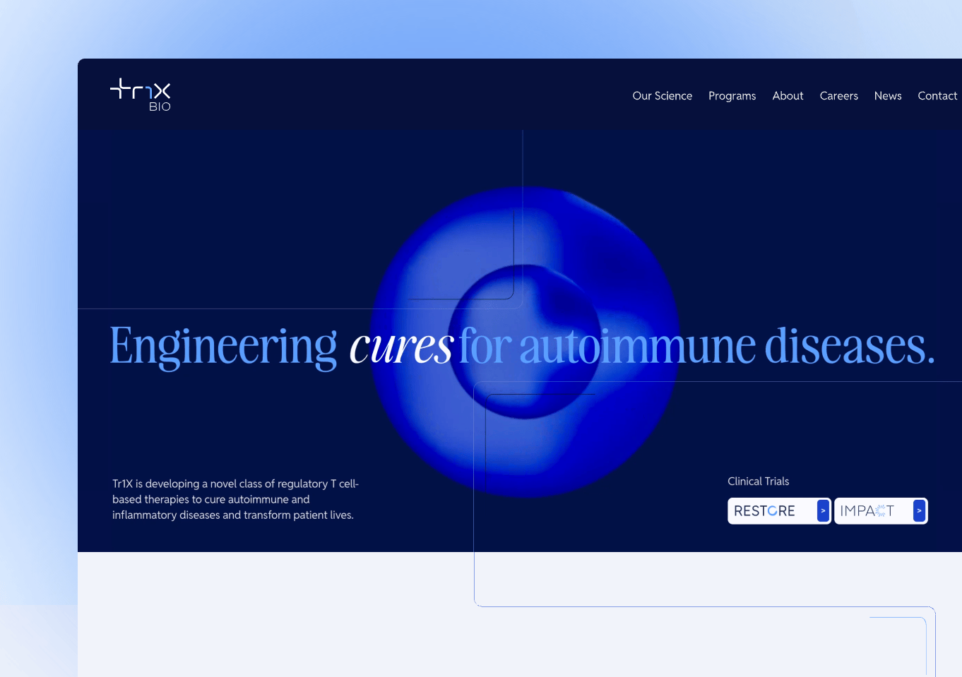
Tr1X BioDesigning Two Brands That Feel Different and Connected at the Same Time
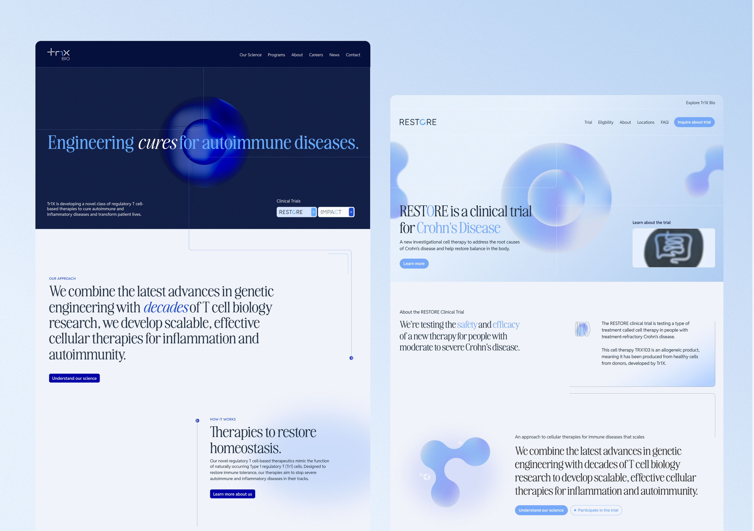
Tr1X Bio needed to speak to two very different audiences: investors evaluating a first-in-class cell therapy, and patients exploring clinical trial eligibility. The visual problem was real. Those two audiences needed to feel like they were in different places, but the brand still had to hold together as one company.
During creative direction, we presented three concepts. Two pushed the existing palette further, pairing a serif font with sharp, high-contrast blues to give Tr1X a bold, distinctive presence in a space where sans serif is the default. The third was the unexpected option, softer colors and a more approachable feel. The client chose that one for the trials brand.
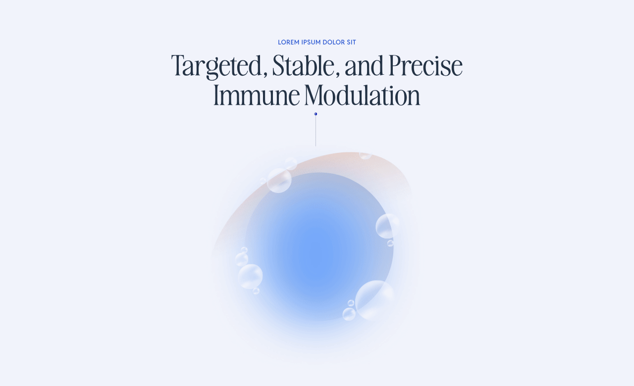
So the design challenge shifted. How do you take two concepts that feel visually different and make them feel like they came from the same place? The answer was in the system rules. The typeface stayed the same across both brands. The color palette was the same. What changed was how those colors were used. High contrast and stark for Tr1X, and those same colors pulled back more subtly for Tr1X Trials, with softer illustration tones carrying more of the visual weight. The illustration style is identical; only the color application differs.
The result is a parent brand that feels bold and credible to investors and a trials brand that feels welcoming and clear to patients, connected by the same visual DNA underneath.