

Moments
Staying in the moment
ROLE
TOOLS
UX/UI Designer
Figma, Google Forms
Social
Community

Problem
The founders encountered the following issues during group gatherings:
Having to assign someone within the group to take photos
Sharing those photos with the rest of the group
The designated photographer often being left out of the photos
Outcome
We created an app that allows users to easily book a local photographer, freeing them to enjoy the moment with their loved ones while the photographer captures the memories. The app also includes a party mode feature that enables multiple users to take photos and share them with each other.
RESEARCH
Understanding the users & identifying their problems
Methodologies
User survey
Competitor analysis
Essential features analysis (MVP)
Research Goals
Throughout the course of this project, I conducted three distinct types of research: foundation, secondary, and design.
The foundation research aimed to provide a better understanding of our target audience and the specific situations in which they would use our app, as well as identify our competitors and their strategies.
For the design research, I conducted usability testing to gain insight into the impact of our app's design and identify areas for improvement. This research helped us refine our approach and create a more user-friendly product.
Survey
After surveying 15 people to learn more about who the target audience would be and what problems they currently encountered, we learned:
75% were women
48% of those women were mothers
This data changed our initial plans and altered the approach to be more mindful of safety, and explore options for photographer alternatives (aka party mode).
Competitor Analysis
The market is full of on-demand photography, but I learned in the competitor analysis that Moments was offering unique features the competitors are not, such as the group voting.

IDEATE
Exploring Solutions
User flow
Establishing the information architect of the app, and how the user will move through the experience was a crucial step in this process. After mapping out the overall experience, I zoomed in on the specific user flows to uncover any potential unhappy paths.


Wireframes
Similar to the user flows, the wireframes was through various alterations. Due to this stage of the project, I was finalizing the wireframes for initial prototype for stakeholder review and early user testing.


Project setback & restraints
Problem
Unfortunately, there was a major setback at this point of the project which caused two major constraints. The previous development was was replaced, which resulted in a budget and development restriction in oder to streamline the process. This resulting in scrapping the user testing.
Outcome
During my initial research I learned that the product we were building was unique to the market. I knew testing some of the major flows was essential to the success of this app. So I took matters into my own hands, to ensure the users needs were being met and conducted a moderated usability test on 8 people on my own time. Below were my findings.
PROTOTYPE & TEST
Exploring Solutions
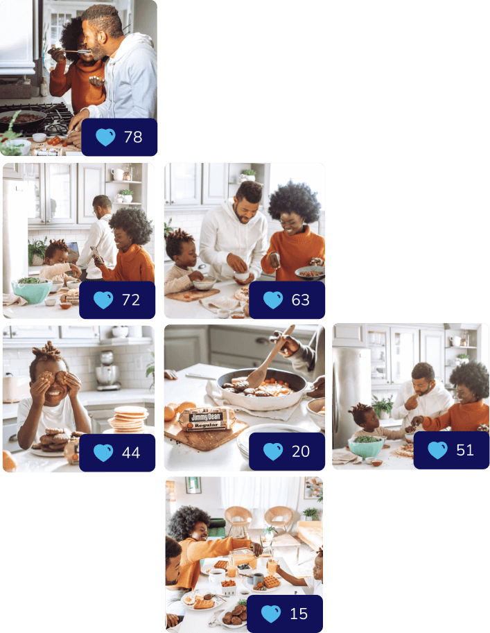
Unhappy Path
The new constraints were impacting the initial designs, so we often met together to talk through potential solutions. One instances, was the user flow for changing their initial vote. The developers had requested to put a back button on an existing design (as seen on the right), but this did not seem initiative, so I conducted a moderated A/B test on a few users.
USER OBJECTIVE
Change vote
DEV REQUEST FLOW
When a user changes their vote, they will select an image in their gallery which will bring them to a screen that reflects the voting screen. From there they change their vote, and click the go back button to navigate to the gallery again.
PROBLEM
The voting screen is highly active with images coming in from the photographer and replicating it for another purpose caused confusion in the A/B tests.
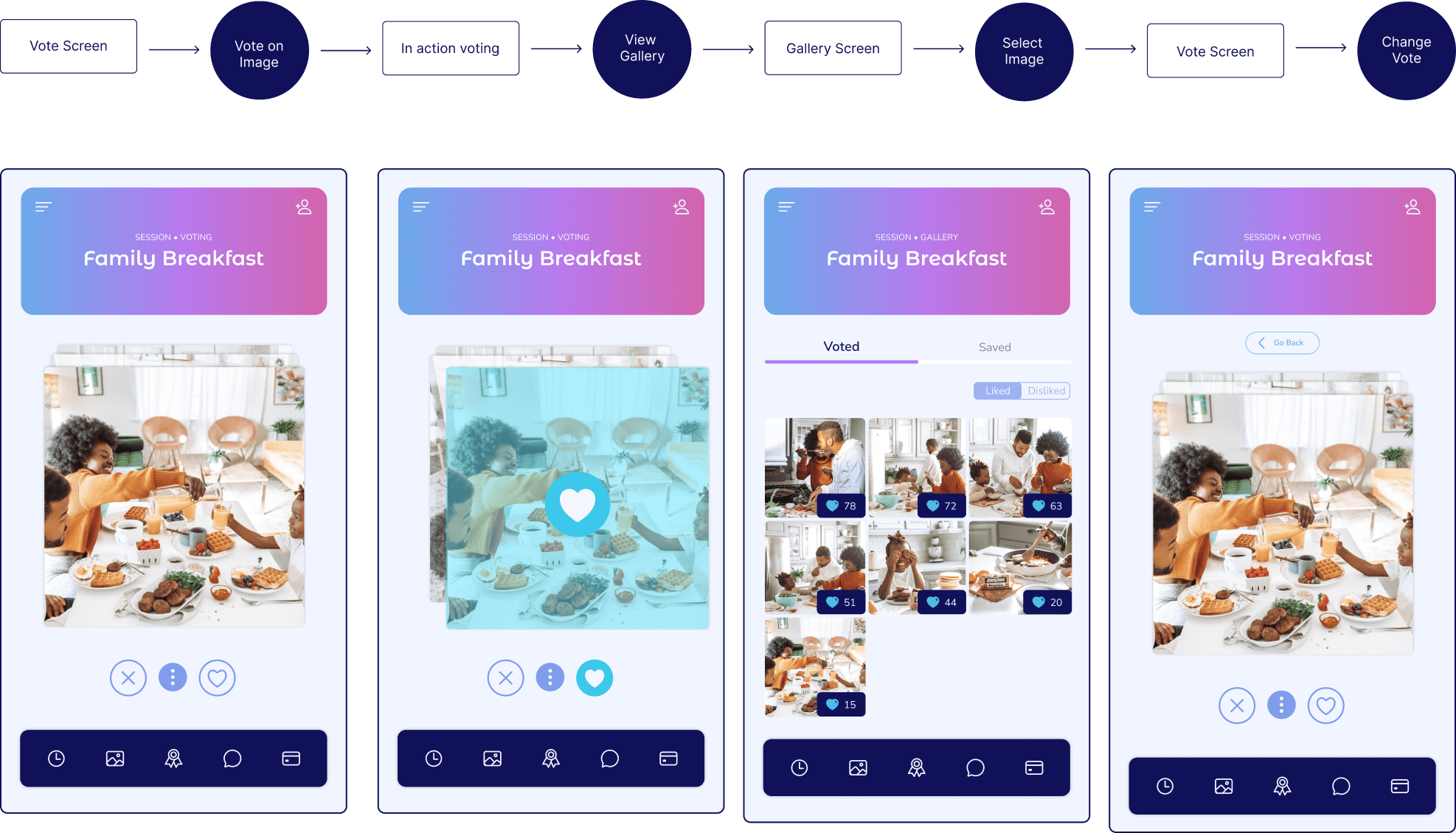
Happy Path
SOLUTION
To create an initiative flow the solution is creating a pop-up when they select an image. The pop-up allows them to like, dislike, save or download, and does not take them completely out of their current experience.
OUTCOME
The outcome was the development requests in order to streamline the process for a MVP launch. Once the next round is available for launch, these changes would be made

WRAP UP
Final thoughts & takeaways
Deliverables
The final deliverables included over 50 screens designed and prototype in Figma.
Collaboration with Developers
This project was my first experience working closely with developers, and I feel fortunate to have collaborated with such an enthusiastic and skilled team. Throughout the process, I gained valuable insights into their perspectives and learned how I could better assist as a designer. It was an eye-opening experience that deepened my understanding of the importance of teamwork between designers and developers, and I now have a clearer vision of how to effectively merge design and development efforts in future projects.
Lessons learned
User feedback
Throughout this project, I had an eye-opening experience about the significance of user feedback. Amidst various factors like development constraints and business goals, I wholeheartedly embraced my role as a UX designer—to be a genuine advocate for the user. It became clear that incorporating their feedback at different stages of the app was vital in creating a product that truly catered to their needs. Despite the restraints, I sought for ways to incorporate user feedback on my own time.